This is the style guide for Dat, an open source, decentralized data tool for distributing datasets. This styleguide provides general design guidance for dat projects, and also comes with an API for importing (s)css assets into your projects. If some dat project is in need of a new design element or concept please open an issue.
Dat Logo
Dat Data Logo
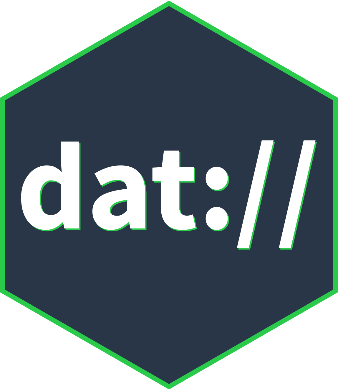
 This is the Dat logo. It consists of the hexagon in Dat green and the centered "dat DATA" set in Source Sans. Only use it when it can be displayed at least 60px tall, in order to keep the text legible.
Dat Hexagon
 Use the green hexagon without text when the logo is displayed in small sizes, e.g. in small header bars or favicons.
Dat Palette
Neutral Color Shades
Use the dark blue for all text. Also use this color and its various shades for form elements, borders and other neutral elements.
Brand Color
Dat Green is the brand color and is used in the logo. It’s also the default color for links and important buttons.
UI and Highlight Colors
Use blue, red and yellow for UI purposes like warnings, errors, notifications etc. These colors can also be used for decorative purposes.
Complete List of Colors and variable names
-
#FFFFFF$color-white -
#293648$color-neutral -
#394B5B$color-neutral-90 -
#505F6D$color-neutral-80 -
#65737F$color-neutral-70 -
#7C8792$color-neutral-60 -
#919BA4$color-neutral-50 -
#A7AFB6$color-neutral-40 -
#C3C9CD$color-neutral-30 -
#D3D7DB$color-neutral-20 -
#E0E3E5$color-neutral-14 -
#E9EBEC$color-neutral-10 -
#F6F7F8$color-neutral-04 -
#2ACA4B$color-green -
#24943A$color-green-hover -
#147F26$color-green-darker -
#99D9A6$color-green-disabled -
#2980B9$color-blue -
#1B679A$color-blue-hover -
#0d4d84$color-blue-darker -
#94BFDC$color-blue-disabled -
#159F84$color-mint -
#0B856D$color-mint-hover -
#05654E$color-mint-darker -
#8ACFC1$color-mint-disabled -
#F0C30E$color-yellow -
#C9A001$color-yellow-hover -
#C38D00$color-yellow-darker -
#f7E186$color-yellow-disabled -
#D8524E$color-red -
#B33C38$color-red-hover -
#A52724$color-red-darker -
#EBA8A6$color-red-disabled
Dat Typography
Typeface
The dat typeface is Source Sans Pro, Adobe’s first open source typeface family. It is a sans serif typeface intended to work well in user interfaces. The complete family is available on Google Fonts.
To embed Source Sans Pro into a webpage, copy this code into the
of your HTML document:<link href="https://fonts.googleapis.com/css?family=Source+Sans+Pro:400,700" rel="stylesheet">And use the following CSS to specify this font-family:
font-family: 'Source Sans Pro', 'Helvetica Neue', 'Lucida Grande', Arial, sans-serif;Headings
This is an example heading lorem ipsum test text
This is an example heading lorem ipsum test text
This is an example heading lorem ipsum test text
This is an example heading lorem ipsum test text
This is an example heading lorem ipsum test text
This is an example heading lorem ipsum test text
For text-heavy websites that are optimized for readability (documentation, dat website etc.), set the default font-size to 100% of the browser style sheet and use the rem unit to size the text and almost every other element. The rem unit is relative to the root element. That allows us to define a single font size on the html element and define all rem units to be a percentage of that. E.g. 1rem = 16px, 1.5rem = 24px, 28px = 1.75rem …
The headings’ line-height is the sum of the font-size + 0.5rem.
Paragraphs, Lists and Blockquotes
Paragraphs
This is a lead paragraph. Lorem ipsum dolor sit amet, consectetur adipisicing elit, sed do eiusmod tempor incididunt ut labore et dolore magna aliqua. Ut enim ad minim veniam.
Lorem ipsum dolor sit amet, consectetur adipisicing elit, sed do eiusmod tempor incididunt ut labore et dolore magna aliqua. Ut enim ad minim veniam, quis nostrud exercitation ullamco laboris nisi ut aliquip ex ea commodo consequat. Duis aute irure dolor in reprehenderit in voluptate velit esse cillum dolore eu fugiat nulla pariatur. Excepteur sint occaecat cupidatat non proident, sunt in culpa qui officia deserunt mollit anim id est laborum.
Unordered List
- a list item
- another list item
- Lorem ipsum dolor sit amet, consectetur adipisicing elit, sed do eiusmod tempor incididunt ut labore et dolore magna aliqua. Ut enim ad minim veniam, quis nostrud exercitation ullamco laboris nisi ut aliquip ex ea commodo consequat.
- one more thing on a list
Ordered List
- a list item
- another list item
- Lorem ipsum dolor sit amet, consectetur adipisicing elit, sed do eiusmod tempor incididunt ut labore et dolore magna aliqua. Ut enim ad minim veniam, quis nostrud exercitation ullamco laboris nisi ut aliquip ex ea commodo consequat.
Plain Lists
You can add class="list-plain" to <ul> and <ol> elements to remove the padding, margin, and list-style-type easily. There is also an scss mixin by the same name available.
- a list item from an <ol> with class="list-plain"
- another list item
- etc
Blockquote
Lorem ipsum dolor sit amet, consectetur adipisicing elit, sed do eiusmod tempor incididunt ut labore et dolore magna aliqua. Ut enim ad minim veniam, quis nostrud exercitation ullamco laboris nisi ut aliquip ex ea commodo consequat.
Dat Links
Default Links
Default links are green and look like this: Default Link. Lorem ipsum dolor sit amet, consectetur adipisicing elit, sed do eiusmod tempor incididunt ut labore et dolore magna aliqua. Ut enim ad Default Link minim veniam, quis nostrud exercitation ullamco laboris nisi ut aliquip ex ea commodo consequat.
Other Links
Dat Buttons
Button Colors
Button Sizes
Dat Transitions
For consistent transitions, use the transition variables$transition-duration and $transition-timing-function.